关于display: box 和 box-flex
摘要:这两天做手机项目,使用到这个css3新属性。现在还不为所有浏览器支持,所以使用的时候要加上前缀。使用方法见下面:html代码:品牌介绍优惠信...
这两天做手机项目,使用到这个css3新属性。现在还不为所有浏览器支持,所以使用的时候要加上前缀。使用方法见下面:
html代码:
<div class="s-indLine">
            <div class="s-indNav s-indIntro">
                <span class="s-icon"></span>
                <p>品牌介绍</p>
            </div>
            <div class="s-indNav s-indInfo">
                <span class="s-icon"></span>
                <p>优惠信息</p>
            </div>
        </div>
        <div class="s-indLine">
            <div class="s-indNav s-indShop">
                <span class="s-icon"></span>
                <p>门店查找</p>
            </div>
            <div class="s-indNav s-indGoods">
                <span class="s-icon"></span>
                <p>热卖商品</p>
            </div>
        </div>
css代码:
.s-indLine{
    display: -webkit-box;
    display: -moz-box;
    display: box;
    margin-bottom: 10px;
    -moz-box-orient:horizontal;
    -webkit-box-orient:horizontal;
    box-orient:horizontal;
}
.s-indLine .s-indNav{
    -webkit-box-flex: 5;
    -moz-box-flex: 5;
    box-flex: 5;
    -webkit-box-sizing: border-box;
    -moz-box-sizing: border-box;
    box-sizing: border-box;
    border-radius: 10px;
    color: #ffffff;
    text-align: center;
    height: 105px;
    padding: 15px 0px;
    font-size: 1.5rem;
}
.s-indLine .s-indNav:first-child{
    margin-right: 10px;
}
.s-indIntro{
    background: #4eb566;
}
.s-indInfo{
    background: #ffa422;
}
.s-indShop{
    background: #7788f2;
}
.s-indGoods{
    background: #ef604d;
}
.s-indLine .s-indNav .s-icon, .s-groupNav .s-icon{
    width: 50px;
    height: 50px;
    display: inline-block;
    background-repeat: no-repeat;
    background-size: 100% 100%;
    background-position: center;
}
.s-indIntro .s-icon{
    background-image: url("group.png");
}
.s-indInfo .s-icon{
    background-image: url("group.png");
}
.s-indShop .s-icon{
    background-image: url("group.png");
}
.s-indGoods .s-icon{
    background-image: url("group.png");
}
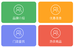
可以不给子元素设置box-flex值,直接使用width代替,也可以设置margin 和 padding 值。得到的效果图如下:
在chrome或者手机其他的以-webkit为内核的浏览器上调试时,上面的代码是没有问题的,但是在火狐下面,会出现问题,如下图所示:
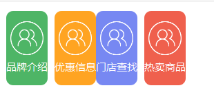
这地方解决办法,必须给父元素添加width样式,例如 width: 100%; 即可。
此外在火狐上还有一个问题,上面说到可以给子元素不设置box-flex,而是设置width,但是在火狐上不能识别width,而是必须设置box-flex。
【关于display: box 和 box-flex】相关文章:
★ HTML5 绘制图像(上)之:关于canvas元素引领下一代web页面的问题
★ html5 canvas里绘制椭圆并保持线条粗细均匀的技巧
★ 用HTML5 Canvas API中的clearRect()方法实现橡皮擦功能
上一篇:
使用html5+js实现像素风头像生成器
下一篇:
H5移动端页面设计心得分享