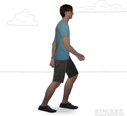
本文分享给大家的是一个用纯CSS3实现的人物行走动画,在没有使用JavaScript的情况下,用CSS3技术将人物行走的姿态描绘得非常逼真。其实动画实现的原理也是比较简单的,将人物行走时的状态分割成多张图片,然后利用CSS3的动画属性将这些图片串联起来形成人物行走动画效果。
HTML代码
XML/HTML Code复制内容到剪贴板 <divid="canvas"> <divclass="sky"> <divclass="cloud-1"></div> <divclass="cloud-2"></div> <divclass="cloud-3"></div> <divclass="cloud-4"></div> <divclass="cloud-5"></div> <divclass="cloud-6"></div> <divclass="cloud-7"></div> <divclass="cloud-8"></div> </div> <divclass="horizon"></div> <divclass="ground"> <divclass="sign-best"></div> <divclass="sign-no-js"></div> <divclass="sign-lots-of-divs"></div> <divclass="sign-all-css"></div> </div> <> <divclass="shadow"></div> <divclass="me"> <divclass="torso"> <divclass="leftleg"> <divclass="leftthigh"> <divclass="leftshin"> <divclass="leftfoot"> <divclass="lefttoes"></div> </div> </div> </div> </div> <> <divclass="rightleg"> <divclass="rightthigh"> <divclass="rightshin"> <divclass="rightfoot"> <divclass="righttoes"></div> </div> </div> </div> </div> <> <divclass="leftarm"> <divclass="leftbicep"> <divclass="leftforearm"></div> </div> </div> <> <divclass="rightarm"> <divclass="rightbicep"> <divclass="rightforearm"></div> </div> </div> <> </div> <> </div> <> <divclass="overlay"></div> </div>
基本CSS代码
CSS Code复制内容到剪贴板 #canvas{ height:600px; width:760px; margin:0; padding:0; position:relative; overflow:hidden; } #canvasdiv{ position:absolute; -webkit-animation-iteration-count:infinite; -moz-animation-iteration-count:infinite; -ms-animation-iteration-count:infinite; -o-animation-iteration-count:infinite; animation-iteration-count:infinite; -webkit-animation-timing-function:linear; -moz-animation-timing-function:linear; -ms-animation-timing-function:linear; -o-animation-timing-function:linear; animation-timing-function:linear; } #canvas:targetdiv:not(.overlay){ border:1pxsolidblack; } #canvas:targetdiv.mediv{ background:rgba(255,255,255,0.25); } .me{ top:50px;left:350px; -webkit-animation-name:me; -moz-animation-name:me; -ms-animation-name:me; -o-animation-name:me; animation-name:me; } .me,.mediv{ background-repeat:no-repeat; -webkit-animation-duration:1750ms; -moz-animation-duration:1750ms; -ms-animation-duration:1750ms; -o-animation-duration:1750ms; animation-duration:1750ms; } .torso{ width:86px;height:275px; background-image:url(images/me/torso.png); } .arm{ left:12px; -webkit-transform-origin:20px10px; -moz-transform-origin:20px10px; -ms-transform-origin:20px10px; -o-transform-origin:20px10px; transform-origin:20px10px; } .rightright.arm{ top:93px; -webkit-animation-name:rightright-bicep; -moz-animation-name:rightright-bicep; -ms-animation-name:rightright-bicep; -o-animation-name:rightright-bicep; animation-name:rightright-bicep; } .left.arm{ top:87px; -webkit-animation-name:left-bicep; -moz-animation-name:left-bicep; -ms-animation-name:left-bicep; -o-animation-name:left-bicep; animation-name:left-bicep; } .bicep{ height:124px;width:51px; } .rightright.bicep{background-image:url(images/me/rightright-bicep.png);} .left.bicep{background-image:url(images/me/left-bicep.png);} .forearm{ top:108px;left:14px; width:36px;height:121px; -webkit-transform-origin:3px7px; -moz-transform-origin:3px7px; -ms-transform-origin:3px7px; -o-transform-origin:3px7px; transform-origin:3px7px; } .rightright.forearm{ background-image:url(images/me/rightright-forearm.png); -webkit-animation-name:rightright-forearm; -moz-animation-name:rightright-forearm; -ms-animation-name:rightright-forearm; -o-animation-name:rightright-forearm; animation-name:rightright-forearm; } .left.forearm{ background-image:url(images/me/left-forearm.png); -webkit-animation-name:left-forearm; -moz-animation-name:left-forearm; -ms-animation-name:left-forearm; -o-animation-name:left-forearm; animation-name:left-forearm; } .leg{ left:6px; -webkit-transform-origin:30px20px; -moz-transform-origin:30px20px; -ms-transform-origin:30px20px; -o-transform-origin:30px20px; transform-origin:30px20px; -webkit-animation-name:thigh; -moz-animation-name:thigh; -ms-animation-name:thigh; -o-animation-name:thigh; animation-name:thigh; } .rightright.leg{ top:235px; -webkit-animation-name:rightright-thigh; -moz-animation-name:rightright-thigh; -ms-animation-name:rightright-thigh; -o-animation-name:rightright-thigh; animation-name:rightright-thigh; } .left.leg{ top:225px; -webkit-animation-name:left-thigh; -moz-animation-name:left-thigh; -ms-animation-name:left-thigh; -o-animation-name:left-thigh; animation-name:left-thigh; } .thigh{ width:70px;height:145px; } .left.thigh{background-image:url(images/me/left-thigh.png);} .rightright.thigh{background-image:url(images/me/rightright-thigh.png);} .shin{ top:115px; width:50px;height:170px; background-image:url(images/me/shin.png); -webkit-transform-origin:30px25px; -moz-transform-origin:30px25px; -ms-transform-origin:30px25px; -o-transform-origin:30px25px; transform-origin:30px25px; } .rightright.shin{ -webkit-animation-name:rightright-shin; -moz-animation-name:rightright-shin; -ms-animation-name:rightright-shin; -o-animation-name:rightright-shin; animation-name:rightright-shin; } .left.shin{ -webkit-animation-name:left-shin; -moz-animation-name:left-shin; -ms-animation-name:left-shin; -o-animation-name:left-shin; animation-name:left-shin; } .foot{ top:155px;left:2px; width:67px;height:34px; background-image:url(images/me/foot.png); -webkit-transform-origin:050%; -moz-transform-origin:050%; -ms-transform-origin:050%; -o-transform-origin:050%; transform-origin:050%; } .rightright.foot{ -webkit-animation-name:rightright-foot; -moz-animation-name:rightright-foot; -ms-animation-name:rightright-foot; -o-animation-name:rightright-foot; animation-name:rightright-foot; } .left.foot{ -webkit-animation-name:left-foot; -moz-animation-name:left-foot; -ms-animation-name:left-foot; -o-animation-name:left-foot; animation-name:left-foot; } .toes{ top:9px;left:66px; width:28px;height:25px; background-image:url(images/me/toes.png); -webkit-transform-origin:0%100%; -moz-transform-origin:0%100%; -ms-transform-origin:0%100%; -o-transform-origin:0%100%; transform-origin:0%100%; } .rightright.toes{ -webkit-animation-name:rightright-toes; -moz-animation-name:rightright-toes; -ms-animation-name:rightright-toes; -o-animation-name:rightright-toes; animation-name:rightright-toes; } .left.toes{ -webkit-animation-name:left-toes; -moz-animation-name:left-toes; -ms-animation-name:left-toes; -o-animation-name:left-toes; animation-name:left-toes; } .shadow{ width:200px;height:70px; left:270px;bottombottom:5px; background-image:url(images/misc/shadow.png); -webkit-animation-name:shadow; -moz-animation-name:shadow; -ms-animation-name:shadow; -o-animation-name:shadow; animation-name:shadow; } /*settingproperz-indexessothatlimbsshowupcorrectly*/ div.rightright.arm{z-index:1;} div.left.arm{z-index:-3;} div.arm>div.bicep>div.forearm{z-index:-1;} div.rightright.leg{z-index:-1;} div.left.leg{z-index:-2;} div.leg>div.thigh>div.shin{z-index:-1;} .overlay{ width:100%;height:100%; background:url(images/misc/gradient-left.png)repeat-ytopleft, url(images/misc/gradient-rightright.png)repeat-ytoprightright; } .skydiv{ background-repeat:no-repeat; -webkit-animation-name:prop-1200; -moz-animation-name:prop-1200; -ms-animation-name:prop-1200; -o-animation-name:prop-1200; animation-name:prop-1200; } .cloud-1,.cloud-2{ width:82px;height:90px; background-image:url(images/clouds/1.png); -webkit-animation-duration:120s; -moz-animation-duration:120s; -ms-animation-duration:120s; -o-animation-duration:120s; animation-duration:120s; } .cloud-3,.cloud-4{ top:70px; width:159px;height:90px; background-image:url(images/clouds/2.png); -webkit-animation-duration:80s; -moz-animation-duration:80s; -ms-animation-duration:80s; -o-animation-duration:80s; animation-duration:80s; } .cloud-5,.cloud-6{ top:30px; width:287px;height:62px; background-image:url(images/clouds/3.png); -webkit-animation-duration:140s; -moz-animation-duration:140s; -ms-animation-duration:140s; -o-animation-duration:140s; animation-duration:140s; } .cloud-7,.cloud-8{ top:100px; width:94px;height:81px; background-image:url(images/clouds/4.png); -webkit-animation-duration:90s; -moz-animation-duration:90s; -ms-animation-duration:90s; -o-animation-duration:90s; animation-duration:90s; } .cloud-1{left:0px;} .cloud-2{left:1200px;} .cloud-3{left:250px;} .cloud-4{left:1450px;} .cloud-5{left:500px;} .cloud-6{left:1700px;} .cloud-7{left:950px;} .cloud-8{left:2150px;} .horizon{ top:350px; width:1800px;height:50px; background:url(images/misc/horizon.png)repeat-x; -webkit-animation-name:prop-600; -moz-animation-name:prop-600; -ms-animation-name:prop-600; -o-animation-name:prop-600; animation-name:prop-600; -webkit-animation-duration:40s; -moz-animation-duration:40s; -ms-animation-duration:40s; -o-animation-duration:40s; animation-duration:40s; } .grounddiv{ background-repeat:no-repeat; -webkit-animation-name:prop-2000; -moz-animation-name:prop-2000; -ms-animation-name:prop-2000; -o-animation-name:prop-2000; animation-name:prop-2000; } .sign-all-css{ width:160px;height:188px; top:325px;left:1600px; background-image:url(images/signs/all-css.png); -webkit-animation-duration:35s; -moz-animation-duration:35s; -ms-animation-duration:35s; -o-animation-duration:35s; animation-duration:35s; } .sign-lots-of-divs{ width:102px;height:120px; top:345px;left:1150px; background-image:url(images/signs/lots-of-divs.png); -webkit-animation-duration:56s; -moz-animation-duration:56s; -ms-animation-duration:56s; -o-animation-duration:56s; animation-duration:56s; } .sign-no-js{ width:65px;height:77px; top:348px;left:1150px; background-image:url(images/signs/no-js.png); -webkit-animation-duration:71s; -moz-animation-duration:71s; -ms-animation-duration:71s; -o-animation-duration:71s; animation-duration:71s; } .sign-best{ width:43px;height:50px; top:350px;left:1000px; background-image:url(images/signs/best.png); -webkit-animation-duration:95s; -moz-animation-duration:95s; -ms-animation-duration:95s; -o-animation-duration:95s; animation-duration:95s; }
CSS动画相关代码
CSS Code复制内容到剪贴板 @-webkit-keyframesme{ 0%{-webkit-transform:rotate(5deg)translate(5px,0px);} 25%{-webkit-transform:rotate(5deg)translate(-5px,-14px);} 50%{-webkit-transform:rotate(5deg)translate(5px,0px);} 75%{-webkit-transform:rotate(5deg)translate(-5px,-14px);} 100%{-webkit-transform:rotate(5deg)translate(5px,0px);} } @-webkit-keyframesrightright-bicep{ 0%{-webkit-transform:rotate(26deg);} 50%{-webkit-transform:rotate(-20deg);} 100%{-webkit-transform:rotate(26deg);} } @-webkit-keyframesleft-bicep{ 0%{-webkit-transform:rotate(-20deg);} 50%{-webkit-transform:rotate(26deg);} 100%{-webkit-transform:rotate(-20deg);} } @-webkit-keyframesrightright-forearm{ 0%{-webkit-transform:rotate(-10deg);} 50%{-webkit-transform:rotate(-45deg);} 100%{-webkit-transform:rotate(-10deg);} } @-webkit-keyframesleft-forearm{ 0%{-webkit-transform:rotate(-45deg);} 50%{-webkit-transform:rotate(-10deg);} 100%{-webkit-transform:rotate(-45deg);} } @-webkit-keyframesrightright-thigh{ 0%{-webkit-transform:rotate(-45deg);} 50%{-webkit-transform:rotate(10deg);} 100%{-webkit-transform:rotate(-45deg);} } @-webkit-keyframesleft-thigh{ 0%{-webkit-transform:rotate(10deg);} 50%{-webkit-transform:rotate(-45deg);} 100%{-webkit-transform:rotate(10deg);} } @-webkit-keyframesrightright-shin{ 0%{-webkit-transform:rotate(30deg);} 25%{-webkit-transform:rotate(20deg);} 50%{-webkit-transform:rotate(20deg);} 75%{-webkit-transform:rotate(85deg);} 100%{-webkit-transform:rotate(30deg);} } @-webkit-keyframesleft-shin{ 0%{-webkit-transform:rotate(20deg);} 25%{-webkit-transform:rotate(85deg);} 50%{-webkit-transform:rotate(30deg);} 75%{-webkit-transform:rotate(20deg);} 100%{-webkit-transform:rotate(20deg);} } @-webkit-keyframesrightright-foot{ 0%{-webkit-transform:rotate(-5deg);} 25%{-webkit-transform:rotate(-7deg);} 50%{-webkit-transform:rotate(-16deg);} 75%{-webkit-transform:rotate(-10deg);} 100%{-webkit-transform:rotate(-5deg);} } @-webkit-keyframesleft-foot{ 0%{-webkit-transform:rotate(-16deg);} 25%{-webkit-transform:rotate(-10deg);} 50%{-webkit-transform:rotate(-5deg);} 75%{-webkit-transform:rotate(-7deg);} 100%{-webkit-transform:rotate(-16deg);} } @-webkit-keyframesrightright-toes{ 0%{-webkit-transform:rotate(0deg);} 25%{-webkit-transform:rotate(-10deg);} 50%{-webkit-transform:rotate(-10deg);} 75%{-webkit-transform:rotate(-25deg);} 100%{-webkit-transform:rotate(0deg);} } @-webkit-keyframesleft-toes{ 0%{-webkit-transform:rotate(-10deg);} 25%{-webkit-transform:rotate(-25deg);} 50%{-webkit-transform:rotate(0deg);} 75%{-webkit-transform:rotate(-10deg);} 100%{-webkit-transform:rotate(-10deg);} } @-webkit-keyframesshadow{ 0%{opacity:1;} 25%{opacity:0.75;} 50%{opacity:1;} 75%{opacity:0.75;} 100%{opacity:1;} } @-webkit-keyframesprop-600{ 0%{-webkit-transform:translateX(0px);} 100%{-webkit-transform:translateX(-600px);} } @-webkit-keyframesprop-1200{ 0%{-webkit-transform:translateX(0px);} 100%{-webkit-transform:translateX(-1200px);} } @-webkit-keyframesprop-2000{ 0%{-webkit-transform:translateX(0px);} 100%{-webkit-transform:translateX(-2000px);} }
以上就是本文的全部内容,希望对大家的学习有所帮助。
【非常震撼的纯CSS3人物行走动画】相关文章: