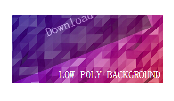
查字典教程网之前已经介绍很多利用纯css3实现鼠标特效的文章了,今天给大家带来一款基于css3非常实用的鼠标悬停特效。这款特效,当鼠标经过时候一个半透明的遮罩层倒下来。效果很好,而且是纯css3实现的,代码很少,非常实用。 效果如下:
实现的代码:
html代码:
<div align="center">
<div>
<div>
LOW POLY BACKGROUND</div>
<div>
Download</div>
</div>
</div>
css3代码:
.contener
{
width:310px;
height:140px;
background-image:url(fond.png);
overflow: hidden;
cursor: pointer;
position:relative;
}
.txt_init
{
position: absolute;
bottom: 5px;
right: 5px;
font-family: 'Roboto';
font-size: 22px;
color: #ffffff;
font-weight: 500;
}
.opac
{
opacity: 0;
}
.contener:hover .opac
{
width:310px;
position: absolute;
z-index: 1;
font-family: 'Roboto';
font-size: 25px;
color: #ffffff;
font-weight: 300;
line-height: 140px;
height:140px;
opacity: 1;
background-color: rgba(0,0,0,0.7);
-webkit-animation:oblik 0.4s ease-in;
-webkit-transform-origin: 0% 100%;
-moz-animation:oblik 0.4s ease-in;
-moz-transform-origin: 0% 100%;
-ms-animation:oblik 0.4s ease-in;
-ms-transform-origin: 0% 100%;
animation:oblik 0.4s ease-in;
transform-origin: 0% 100%;
}
@-webkit-keyframes oblik {
0% {opacity:0;-webkit-transform: rotate(-45deg);}
100% {opacity:1;-webkit-transform: rotate(0deg);}
}
@-moz-keyframes oblik {
0% {opacity:0;-moz-transform: rotate(-45deg);}
100% {opacity:1;-moz-transform: rotate(0deg);}
}
@-ms-keyframes oblik {
0% {opacity:0;-ms-transform: rotate(-45deg);}
100% {opacity:1;-ms-transform: rotate(0deg);}
}
@keyframes oblik {
0% {opacity:0;transform: rotate(-45deg);}
100% {opacity:1;transform: rotate(0deg);}
}
【一款纯css3实现的非常实用的鼠标悬停特效演示】相关文章: