在这篇文章中我们将创建纯css3的等待效果动画,不用javaScript,不用jquery,不用图片。
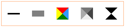
效果如下:
html标记
在这篇文章中用到的html只需要添加一个<div>该div加入一个class=“loading”,如下所示:
<div></div>
CSS
下面通过一个例子实现上图中第三个css效果:
第一部分css
它设置了该div的样式,利用css3我们可以创建很多形状,如线、矩形、圆饼等,我们也可以为其生成纹理和条纹等复杂的效果。
下面我们用div的边框和border样式来实现该效果
.loading
{
width:0;
height:0;
border-right:20px solid #3399ff;
border-top:20px solid red;
border-left:20px solid yellow;
border-bottom:20px solid green;
border-radius: 20px;
-moz-border-radius: 20px;
-webkit-border-radius: 20px;
}
第二部分
我们将用css3来定义动画,让该div旋转360o,我们可以定义旋转方向、速度和移动的风格(linear, ease, …)
.loading {
/* Animate and rotate the spinner using CSS3 Animations */
animation: bganim 0.6s linear 0s infinite;
/* moz: Vendor prefixe for Mozilla Firefox */
-moz-animation: bganim 0.6s linear 0s infinite;
/* webkit: Vendor prefixe for Google Chrome, Chromium, Apple Safari... */
-webkit-animation: bganim 0.6s linear 0s infinite;
}
@keyframes bganim {
/* Rotate the div 360° */
from { transform:rotate(0deg); } to { transform:rotate(360deg); }
}
@-moz-keyframes bganim {
from { -moz-transform:rotate(0deg); } to { -moz-transform:rotate(360deg); }
}
@-webkit-keyframes bganim {
from { -webkit-transform:rotate(0deg); } to { -webkit-transform:rotate(360deg); }
}
上面实现同样的功能我们添加了如”-moz” and “-webkit“等前缀,目的是为了浏览器兼容。你也可以修改上来面代码中旋转角度、速度和旋转样式来达到你的要求。
其它的图形样式:
示例中第一个:
.loading {
height:5px;
width:40px;
background-color:#000000;
}
示例中第二个:
.loading {
/* This is a CSS half cicle */
height:20px;
width:40px;
border-radius: 0 0 90px 90px;
-moz-border-radius: 0 0 90px 90px;
-webkit-border-radius: 0 0 90px 90px;
background:gray;
}
示例中第四个:
.loading {
width:0;
height:0;
border-right:20px solid #444;
border-top:20px solid #777;
border-left:20px solid #aaa;
border-bottom:20px solid #eee;
border-radius: 20px;
-moz-border-radius: 20px;
-webkit-border-radius: 20px;
}
示例中第五个:
.loading {
width:0;
height:0;
border-right:20px solid #fff;
border-top:20px solid #000;
border-left:20px solid #fff;
border-bottom:20px solid #000;
border-radius: 20px;
-moz-border-radius: 20px;
-webkit-border-radius: 20px;
}
【纯CSS3实现多种不同的等待效果(无js/jquery/无图片)】相关文章: