由于用户浏览器分辨率分布、运营维护成本、全站页面宽度规范等原因,2012年末一淘新首页对1200px、990px、750px(for ipad)这3个尺寸的响应不同布局,期望在ipad下横屏显示990px版本,竖版显示750版本,iphone下显示750版本。不同设备尺寸的不同 显示自然少不了viewport设置,目前W3C针对viewport的规范还处于草案阶段,有2种方式可以设置页面的 viewport,viewport meta标签和@viewport css方式。
一、viewport meta element
<meta name=“viewport” content=“width=device-width,initial-scale=1.0”>
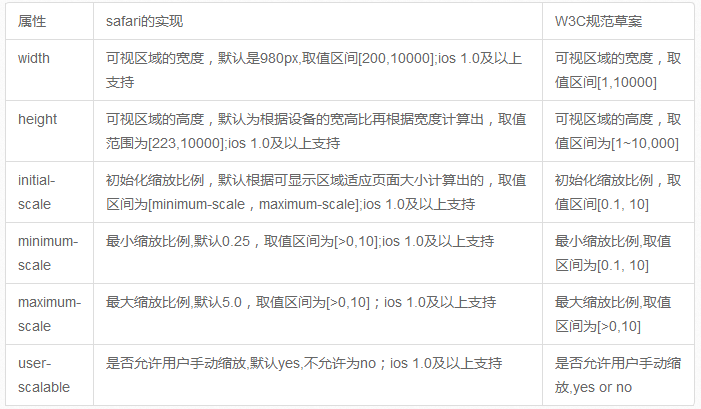
该viewport meta支持以下6个属性,ios对viewport meta的实现对比W3C规范草案:
二、@viewport css
如:
@viewport { width: device-width; zoom: 2.0; }
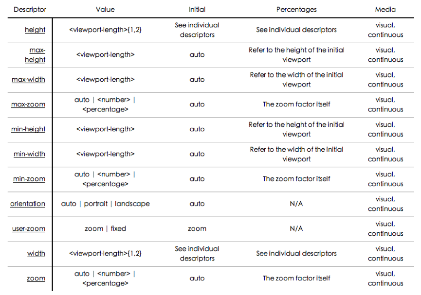
w3c草案中@viewport 支持以下属性
viewport meta方式和@viewport是可以相互转化的,估计以后@viewport是要替代viewport meta的。如:
<meta name=“viewport” content=“width=480, initial-scale=2.0, user-scalable=1”>
可以转化成以下css @viewport { width: 480px; zoom: 2.0; user-zoom: zoom; }
而且@viewport可以和media query联用,天造地设的一双呀,这样可以针对不同的终端尺寸设置不同的viewport。
@viewport {
width: device-width;
} @media screen and (min-width: 400px) {
div { color: red; } }
@media screen and (max-width: 400px) {
div { color: green; }
}
不过,@viewport目前safari并不支持,Opera Mobile 11、ie10支持@viewport,但需要加私有前缀(-o-viewport、-ms-viewport),其他浏览器均不支持

ipad横版990px

ipad竖版750px

ipad横版
ipad竖版

iphone竖版

结果发现左右2边都有大片的空白,原因是safari默认viewport的width是980px,js检测当前viewport确实是 980px,1200、990、750待响应的三个尺寸在980的容器中,所以显示出是750px的设计在980px的容器中居中的效果。 这不是想要的效果,众所周知,ipad的分辨率是1024×768,所以其横版能显示990的设计效果,竖版显示750的设计效果,既然viewport 的默认宽度是980,那就试试改变viewport的width。
ipad横版

ipad竖版

iphone竖版

viewport设置成width=device-width后,不管横版还是竖版viewport都是768px;理论上横版的最大分辨率为 1024,并没有显示990px的效果。测试发现,device-height为1024px,device-width的宽度并不会随着ipad横向还 是竖向而改变,想要横版viewport设置为device-height,竖版时设置为device-width,可以设置initial- scale,.
the same webpage when the initial scale is set to 1.0 on iPhone. Safari on iOS infers the width and height to fit the webpage in the visible area.The viewport width is set to device-width in portrait orientation and device-height in landscape orientation.
初始化不允许缩放设置后,并设置最大最小缩放比例,如果不设置,会导致横版切换到竖版时,页面出现横向滚动条,因为被放大了,设置最大缩放比例后ipad下能达到预期中的效果:
ipad横版 ipad横版

ipad竖版

不过iphone下的就只能看到页面左上角一小部分了,如何解决呢,继续下面的问题 iphone

<meta name=“viewport” content=“initial-scale=1, maximum-scale=2, minimum-scale=1” /> 上面的设置ipad上显示正常,因为initial-scale=1初始化的缩放比例是1,而iphone的此时的viewport width是320,所以只能显示页面左上角320×480的区域。 要实现iphone下面,全屏显示750的效果,根据上面的测试,设置<meta name=“viewport” content=“width=device-width” />即可
如何实现不同设备不同viewport设置呢?
方法1:服务端加个user agent的判断,如果是ipad就显示上面特殊的meta设置。
但是服务端判断user agent也有个缺点,不方便枚举出所有平板电脑的user agent,平板电脑日新月异,维护这么多user agent也是个头疼的事情,不过有个开源的机型库wurfl,目前一淘无线的项目中也使用这个库。
方法2:js判断user agent,切换meta,这个不如服务端判断好。
方法3:css @viewport,这是@viewport的天职;可惜safari还不支持。 针对一淘首页这种情况,应该针对小于750px的设备特殊设置@viewport即可
@media screen and (maxwidth 《 749px) {
@viewport {
width: device-width;
}
}
@viewport safari不支持,最后只能使用方法1在服务端判断设置不同的viewport meta。
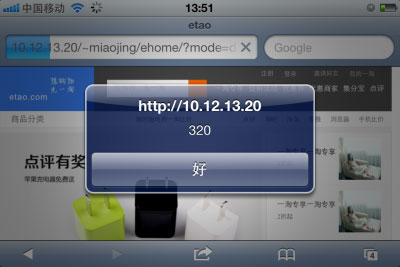
iphone下设置<meta name=“viewport” content=“width=device-width” />是期望中的效果

但是拖动到下面发现页尾背景显示不全
页尾的实现大致如下:
<body>
<div id=“etao-footer”>
content
</div>
</body>
<style> #etao-footer {
background-color: #ccc;
}
</style>
The containing block in which the root element lives
is a rectangle called the initial containing block.
For continuous media, it has the dimensions of the viewport
and is anchored at the canvas origin; it is the page area
for paged media. The ‘direction’ property of the initial
containing block is the same as for the root element.
原因是没有给etao-footer定宽,对于根元素下面的containing block其宽度由viewport的尺寸决定。 iphone下viewport为320,所以看到的效果是background-color只平铺了320px的宽度,解决方法可以针对容器添加个 min-width:750px;所以viewport的设置可能会影响页面根元素的宽度,需要注意下。
结束语
设备适配设置meta viewport相关属性即可,不同设备适配需要服务端判断user agent,更好的设置方式是@viewport,但是safari不支持,所以目前还是meta viewport方式靠谱,设置viewport后可能对页面根元素宽度有影响。
【响应式新首页Device Adaptation小结分析】相关文章: