本文主要讲解的是表单,这个其实对于做过网站的人来说,并不陌生,而且可以说是最为常用的提交数据的Form表单。本文主要来讲解一下内容:
1.基本案例
2.内联表单
3.水平排列的表单
4.被支持的控件
5.静态控件
6.控件状态
7.控件尺寸
8.帮助文本
9.总结
基本案例
单独的表单控件会被自动赋予一些全局样式。所有设置了.form-control的<input>、<textarea>和<select>元素都将被默认设置为width: 100%;。将label和前面提到的这些控件包裹在.form-group中可以获得最好的排列。
<form role="form">
<div>
<label for="exampleInputEmail1">Email address</label>
<input type="email" id="exampleInputEmail1" placeholder="Enter email">
</div>
<div>
<label for="exampleInputPassword1">Password</label>
<input type="password" id="exampleInputPassword1" placeholder="Password">
</div>
<div>
<label for="exampleInputFile">File input</label>
<input type="file" id="exampleInputFile">
<p>Example block-level help text here.</p>
</div>
<div>
<label>
<input type="checkbox"> Check me out
</label>
</div>
<button type="submit">Submit</button>
</form>
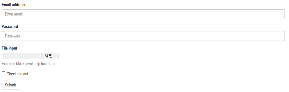
两个文本框的宽度的确为100%。并且有三个form-group。
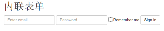
内联表单
为左对齐和inline-block级别的控件设置.form-inline,可以将其排布的更紧凑。
需要设置宽度:在Bootstrap中,input、select和textarea默认被设置为100%宽度。为了使用内联表单,你需要专门为使用到的表单控件设置宽度。
一定要设置label:如果你没有为每个输入控件设置label,屏幕阅读器将无法正确识读。对于这些内联表单,你可以通过为label设置.sr-only已将其隐藏。
<form role="form">
<div>
<label for="exampleInputEmail2">Email address</label>
<input type="email" id="exampleInputEmail2" placeholder="Enter email">
</div>
<div>
<label for="exampleInputPassword2">Password</label>
<input type="password" id="exampleInputPassword2" placeholder="Password">
</div>
<div>
<label>
<input type="checkbox"> Remember me
</label>
</div>
<button type="submit">Sign in</button>
</form>
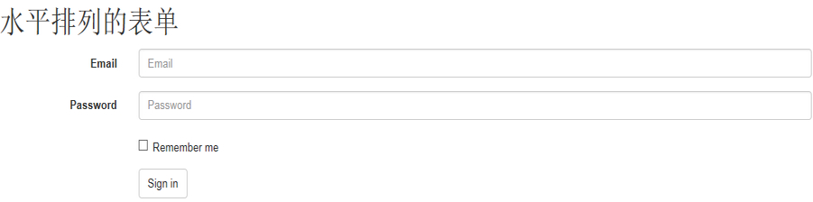
水平排列的表单
通过为表单添加.form-horizontal,并使用Bootstrap预置的栅格class可以将label和控件组水平并排布局。这样做将改变.form-group的行为,使其表现为栅格系统中的行(row),因此就无需再使用.row了。
<form role="form">
<div>
<label for="inputEmail3">Email</label>
<div>
<input type="email" id="inputEmail3" placeholder="Email">
</div>
</div>
<div>
<label for="inputPassword3">Password</label>
<div>
<input type="password" id="inputPassword3" placeholder="Password">
</div>
</div>
<div>
<div>
<div>
<label>
<input type="checkbox"> Remember me
</label>
</div>
</div>
</div>
<div>
<div>
<button type="submit">Sign in</button>
</div>
</div>
</form>
被支持的控件
在表单布局案例中展示了其所支持的标准表单控件。
Input
大部分表单控件、文本输入域控件。包括HTML5支持的所有类型:text、password、datetime、datetime-local、date、month、time、week、number、email、url、search、tel和color。
注意:有正确设置了type的input控件才能被赋予正确的样式。
文本框示例
<input type="text" placeholder="Text input">

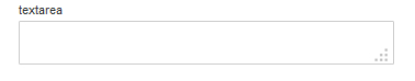
Textarea
支持多行文本的表单控件。可根据需要改变rows属性。
<h1>textarea</h1>
<textarea rows="3"></textarea>
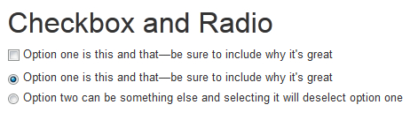
Checkbox 和 radio
Checkbox用于选择列表中的一个或多个选项,而radio用于从多个选项中只选择一个。
默认外观(堆叠在一起)
<div>
<label>
<input type="checkbox" value="">
Option one is this and that—be sure to include why it's great
</label>
</div></p> <p><div>
<label>
<input type="radio" name="optionsRadios" id="optionsRadios1" value="option1" checked>
Option one is this and that—be sure to include why it's great
</label>
</div>
<div>
<label>
<input type="radio" name="optionsRadios" id="optionsRadios2" value="option2">
Option two can be something else and selecting it will deselect option one
</label>
</div>
Inline checkboxes
通过将.checkbox-inline 或 .radio-inline应用到一系列的checkbox或radio控件上,可以使这些控件排列在一行。
<label>
<input type="checkbox" id="inlineCheckbox1" value="option1"> 1
</label>
<label>
<input type="checkbox" id="inlineCheckbox2" value="option2"> 2
</label>
<label>
<input type="checkbox" id="inlineCheckbox3" value="option3"> 3
</label>
同理Radio是一样的,只需要添加一下样式即可。
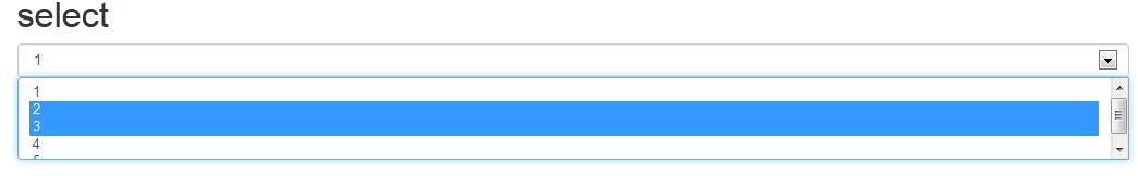
Select
<select>
<option>1</option>
<option>2</option>
<option>3</option>
<option>4</option>
<option>5</option>
</select></p> <p><select multiple>
<option>1</option>
<option>2</option>
<option>3</option>
<option>4</option>
<option>5</option>
</select>
静态控件
在水平布局的表单中,如果需要将一行纯文本放置于label的同一行,为<p>元素添加.form-control-static即可。
<form role="form">
<div>
<label>Email</label>
<div>
<p>email@examtryrtyrple.com</p>
</div>
</div>
<div>
<label for="inputPassword">Password</label>
<div>
<input type="password" id="inputPassword" placeholder="Password">
</div>
</div>
</form>

控件状态
通过为控件和label设置一些基本状态,可以为用户提供回馈。
输入焦点
我们移除了某些表单控件的默认outline样式,并对其:focus状态赋予了box-shadow样式。
<input id="focusedInput" type="text" value="This is focused...">

被禁用的输入框
为输入框设置disabled属性可以防止用户输入,并能改变一点外观,使其更直观。
<input id="disabledInput" type="text" placeholder="Disabled input here..." disabled>

被禁用的fieldset
为<fieldset>设置disabled属性可以禁用<fieldset>中包含的所有控件。
<a>标签的链接功能不受影响
这个class只改变<a class="btn btn-default">按钮的外观,并不能禁用其功能。建议自己通过JavaScript代码禁用链接功能。
跨浏览器兼容性
虽然Bootstrap会将这些样式应用到所有浏览器上,Internet Explorer 9及以下浏览器中的<fieldset>并不支持disabled属性。因此建议在这些浏览器上通过JavaScript代码来禁用fieldset
<form role="form">
<fieldset disabled>
<div>
<label for="disabledTextInput">Disabled input</label>
<input type="text" id="disabledTextInput" placeholder="Disabled input">
</div>
<div>
<label for="disabledSelect">Disabled select menu</label>
<select id="disabledSelect">
<option>Disabled select</option>
</select>
</div>
<div>
<label>
<input type="checkbox"> Can't check this
</label>
</div>
<button type="submit">Submit</button>
</fieldset>
</form>
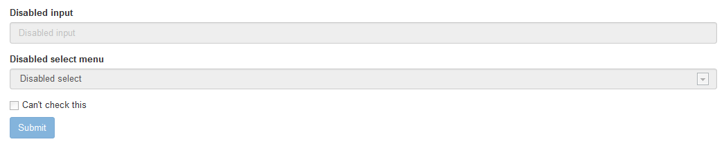
可将鼠标移到各个控件上进行查看效果。
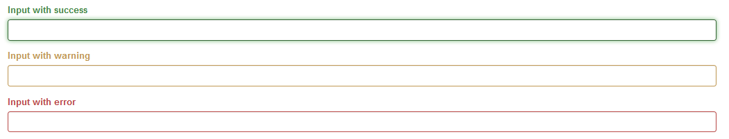
校验状态
Bootstrap对表单控件的校验状态,如error、warning和success状态,都定义了样式。使用时,添加.has-warning、.has-error或.has-success到这些控件的父元素即可。任何包含在此元素之内的.control-label、.form-control和.help-block都将接受这些校验状态的样式。
<div>
<label for="inputSuccess">Input with success</label>
<input type="text" id="inputSuccess">
</div>
<div>
<label for="inputWarning">Input with warning</label>
<input type="text" id="inputWarning">
</div>
<div>
<label for="inputError">Input with error</label>
<input type="text" id="inputError">
</div>
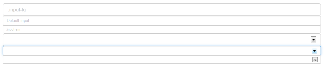
控件尺寸
通过.input-lg之类的class可以为控件设置高度,通过.col-lg-*之类的class可以为控件设置宽度。
高度尺寸
创建大一些或小一些的表单控件以匹配按钮尺寸。
<inputclass="form-controlinput-lg"type="text"placeholder=".input-lg">
<inputclass="form-control"type="text"placeholder="Defaultinput">
<inputclass="form-controlinput-sm"type="text"placeholder=".input-sm"></p> <p><selectclass="form-controlinput-lg">...</select>
<selectclass="form-control">...</select>
<selectclass="form-controlinput-sm">...</select>
调整列尺寸
用栅格系统中的列包裹input或其任何父元素,都可很容易的为其设置宽度。
<divclass="row">
<divclass="col-xs-2">
<inputtype="text"class="form-control"placeholder=".col-xs-2">
</div>
<divclass="col-xs-3">
<inputtype="text"class="form-control"placeholder=".col-xs-3">
</div>
<divclass="col-xs-4">
<inputtype="text"class="form-control"placeholder=".col-xs-4">
</div>
</div>

帮助文本
用于表单控件的块级帮助文本。
<spanclass="help-block">自己独占一行或多行的块级帮助文本。</span>
总结
本篇文章主要讲解表单中各种控件的样式控制。其中也有看到按钮的简单样式使用。
【bootstrap3.0教程之表单(form)使用详解】相关文章:
★ 设置margin和padding为0可去掉DIV与DIV的空白
★ CSS3之边框多颜色Border-color属性使用示例
★ CSS换行详解
★ CSS样式表详解