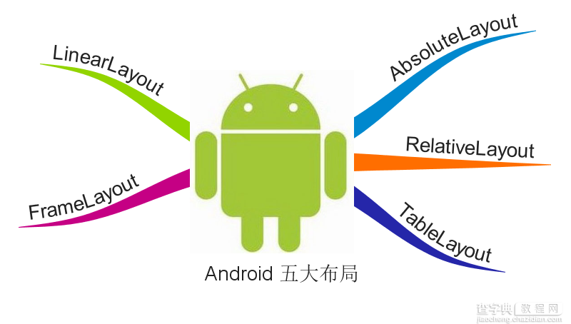
Android总体有五大布局:
线性布局(LiearLayout): 屏幕垂直或水平方向布局。 帧布局(FrameLayout):控件从屏幕左上角开始布局。 相对布局(RelativeLayout): 以其他控件为参照布局。 绝对布局(AbsoluteLayout):以屏幕坐标布局。 表格布局(TableLayout):按照行列方式布局。
一、LinearLayout
线性布局在开发中使用最多,具有垂直方向与水平方向的布局方式,通过设置属性“android:orientation”控制方向,属性值垂直(vertical)和水平(horizontal),默认水平方向。
在使用orientation时需要注意一个问题,假如我们使用默认布局方向,即水平方向,若LinearLayout中存在不止一个控件且都未设置具体宽度,即这样的布局代码:
<LinearLayout android:layout_width="match_parent" android:layout_height="match_parent"> <TextView android:layout_width="match_parent" android:layout_height="wrap_content"/> <TextView android:layout_width="match_parent" android:layout_height="wrap_content"/> </LinearLayout>
则会出现下面的错误:
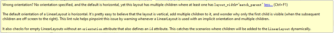
这个错误告诉我们在有多个子控件时需要设置布局方向或至少设置一个子控件在该布局方向的大小,我们可以显示设置布局方向或设置某一个子控件的宽度。
除orientation之外还有以下常用属性:
android:gravity:内部控件对齐方式,常用属性值有center、center_vertical、center_horizontal、top、bottom、left、right等。这个属性在布局组件RelativeLayout、TableLayout中也有使用,FrameLayout、AbsoluteLayout则没有这个属性。
center:居中显示,这里并不是表示显示在LinearLayout的中心,当LinearLayout线性方向为垂直方向时,center表示水平居中,但是并不能垂直居中,此时等同于center_horizontal的作用;同样当线性方向为水平方向时,center表示垂直居中,等同于center_vertical。
top、bottom、left、right顾名思义为内部控件居顶、低、左、右布局。
这里要与android:layout_gravity区分开,layout_gravity是用来设置自身相对于父元素的布局。
android:layout_weight:权重,用来分配当前控件在剩余空间的大小。正常情况下,值越大占据高度或宽度越大。例外的情况,在LineayLayout布局中使用这个属性时需要注意: 当水平方向布局且子控件的宽度为fill_parent或match_parent时,值越小占据宽度越大,垂直方向也一样。分析一下这种情况,类似这样的代码:
<"1.0" encoding="utf-8"?> <LinearLayout xmlns:android="http://schemas.android.com/apk/res/android" android:orientation="horizontal" android:layout_width="match_parent" android:layout_height="match_parent"> <TextView android:layout_width="match_parent" android:layout_height="40dp" android:background="#666666" android:text="第一个子控件" android:gravity="center" android:layout_weight="1"/> <TextView android:layout_width="match_parent" android:layout_height="40dp" android:background="#EE4000" android:text="第二个子控件" android:gravity="center" android:layout_weight="2"/> </LinearLayout>
显示效果:
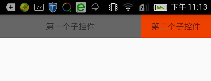
这里出现这种情况主要是因为match_parent或fill_parent引起的,系统先给第一个子控件分配parent_width(剩余空间),再给第二个分配parent_width,即分配了两个parent_width,此时剩余为parent_width-2parent_width=-parent_width,这里主要问题就在这里,剩余控件其实已经为一个负数了。接着,第一个控件占宽度:parent_width(当前已有宽度)+权重1/3*(-parent_width)=2/3parent_width;第二个控件占宽度:parent_width+权重2/3*(-parent_width)=1/3parent_width,所以当宽度都是match_parent时,剩余空间则为负数,谁的权重大谁就会减去越多。
在平常开发中我们会经常用到这个属性,通过设置layout_weight能解决很多不可思议的布局问题。
二、FrameLayout
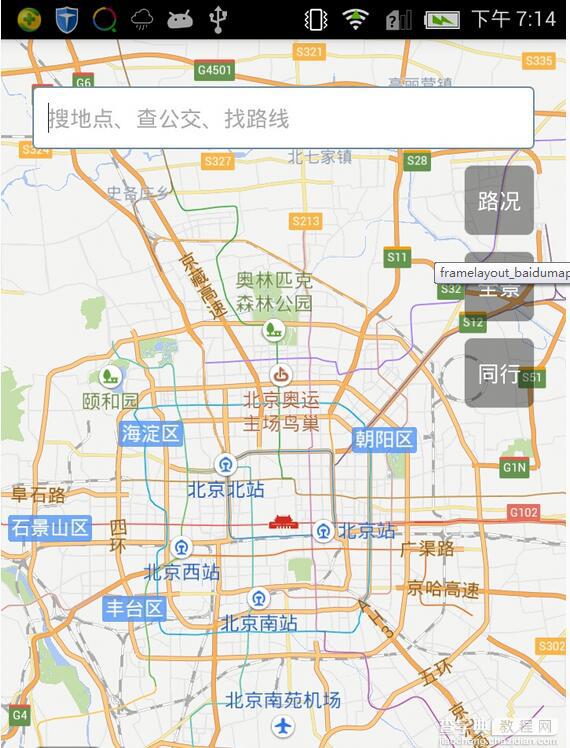
帧布局或叫层布局,从屏幕左上角按照层次堆叠方式布局,后面的控件覆盖前面的控件。该布局在开发中经常用到,因为是按层次方式布局,我们需要实现层面显示的样式时就可以采用这种布局方式,比如我们要实现一个类似百度地图的布局:
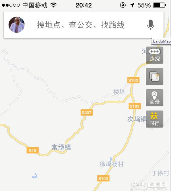
通过这张图我们可以看到地图与操作按钮是分层显示的,运用FrameLayout我们也可以简单实现这样的样式,代码如下:
<"1.0" encoding="utf-8"?> <FrameLayout xmlns:android="http://schemas.android.com/apk/res/android" android:layout_width="match_parent" android:layout_height="match_parent"> <com.baidu.mapapi.map.MapView android:id="@+id/mapShowView" android:layout_width="fill_parent" android:layout_height="fill_parent" android:clickable="true"/> <EditText android:layout_width="match_parent" android:layout_height="40sp" android:background="@drawable/edit_selector" android:layout_marginLeft="20sp" android:layout_marginRight="20sp" android:layout_marginTop="30dp" android:paddingLeft="10sp" android:textSize="14sp" android:hint="搜地点、查公交、找路线" android:textColorHint="#aaaaaa" android:gravity="left|center_vertical"/> <LinearLayout android:layout_width="wrap_content" android:layout_height="wrap_content" android:orientation="vertical" android:layout_gravity="right" android:layout_marginTop="80dp" android:layout_marginRight="20dp"> <Button android:id="@+id/traffic" android:layout_width="45sp" android:layout_height="45sp" android:text="路况" android:textColor="#ffffff" android:textSize="14sp" android:background="@drawable/corner_black_bgborder"/> <Button android:id="@+id/panorama" android:layout_width="45sp" android:layout_height="45sp" android:text="全景" android:textColor="#ffffff" android:textSize="14sp" android:layout_marginTop="10dp" android:background="@drawable/corner_black_bgborder"/> <Button android:id="@+id/company" android:layout_width="45sp" android:layout_height="45sp" android:text="同行" android:textColor="#ffffff" android:textSize="14sp" android:layout_marginTop="10dp" android:background="@drawable/corner_black_bgborder"/> </LinearLayout> <Button android:id="@+id/location" android:layout_width="45sp" android:layout_height="45sp" android:layout_gravity="bottom" android:text="定位" android:textColor="#ffffff" android:textSize="14sp" android:layout_marginLeft="20dp" android:layout_marginBottom="120dp" android:background="@drawable/corner_black_bgborder"/> </FrameLayout>
显示效果:
FrameLayout中第一个子控件为百度地图,其次为输入框、右边操作按钮与左下方定位按钮。我们可以看到这里很多子控件都使用了一个属性,layout_gravity,正如前面讲解gravity属性提到的一样,layout_gravity用来设置自身相对于父元素的布局,这个属性在FrameLayout布局时会经常使用到,用来控制控件在布局中的位置,layout_gravity常用属性值有top、bottom、left、right、center、center_horizontal、center_vertical,这里的center可以让控件居于FrameLayout的中心布局,属性值可以复合使用,比如我们既要居底部布局又要垂直居中就可以这样设置:“android:layout_gravity=bottom|center_vertical”。
代码中的操作控件分三个布局位置,顶部的搜索框、右边的操作按钮、左下方的定位按钮。以下为这三部分的讲解:
1、搜索输入框,根据FrameLayout的定义,子控件从布局的左上角开始按照层次堆叠方式布局,这里输入框,我们需要显示在屏幕的上方,所以只需要设置它的上、左、右方向的margin就可以满足我们的设计。这里让输入框水平居中显示的方式是通过设置宽度为match_parent再设置左右方向相同的margin就可以水平居中,当然也可以通过设置一定的宽度后再设置layout_gravity的属性值为center_horizontal。
2、右边操作按钮栏,三个按钮为LinearLayout布局,垂直方向线性布局,LinearLayout中我们设置“android :layout_gravity=right”来让实现靠右布局,其次设置margin让控件按照合理的布局显示。
3、定位按钮,这个按钮显示在屏幕的左下方,我们只需要设置“android :layout_gravity=bottom”,再设置方向的margin让按钮显示在合理的位置。
三、RelativeLayout
相对布局可以让子控件相对于兄弟控件或父控件进行布局,可以设置子控件相对于兄弟控件或父控件进行上下左右对齐。RelativeLayout能替换一些嵌套视图,当我们用LinearLayout来实现一个简单的布局但又使用了过多的嵌套时,就可以考虑使用RelativeLayout重新布局。
RelativeLayout中子控件常用属性:
1、相对于父控件,例如:android:layout_alignParentTop=“true”
android:layout_alignParentTop 控件的顶部与父控件的顶部对齐;
android:layout_alignParentBottom 控件的底部与父控件的底部对齐;
android:layout_alignParentLeft 控件的左部与父控件的左部对齐;
android:layout_alignParentRight 控件的右部与父控件的右部对齐;
2、相对给定Id控件,例如:android:layout_above=“@id/**”
android:layout_above 控件的底部置于给定ID的控件之上;
android:layout_below 控件的底部置于给定ID的控件之下;
android:layout_toLeftOf 控件的右边缘与给定ID的控件左边缘对齐;
android:layout_toRightOf 控件的左边缘与给定ID的控件右边缘对齐;
android:layout_alignBaseline 控件的baseline与给定ID的baseline对齐;
android:layout_alignTop 控件的顶部边缘与给定ID的顶部边缘对齐;
android:layout_alignBottom 控件的底部边缘与给定ID的底部边缘对齐;
android:layout_alignLeft 控件的左边缘与给定ID的左边缘对齐;
android:layout_alignRight 控件的右边缘与给定ID的右边缘对齐;
3、居中,例如:android:layout_centerInParent=“true”
android:layout_centerHorizontal 水平居中;
android:layout_centerVertical 垂直居中;
android:layout_centerInParent 父控件的中央;
应用实例:
<"1.0" encoding="utf-8"?> <LinearLayout xmlns:android="http://schemas.android.com/apk/res/android" android:layout_width="match_parent" android:layout_height="match_parent"> <RelativeLayout android:layout_width="match_parent" android:layout_height="50dp" android:background="@drawable/topbar_bg_border"> <TextView android:layout_width="wrap_content" android:layout_height="wrap_content" android:layout_centerInParent="true" android:text="标题" android:textSize="19sp" android:textStyle="bold" android:textColor="#4e6288"/> <TextView android:layout_width="wrap_content" android:layout_height="wrap_content" android:layout_centerVertical="true" android:layout_alignParentRight="true" android:layout_marginRight="15dp" android:text="取消" android:textSize="18sp"/> </RelativeLayout> </LinearLayout>
显示结果:
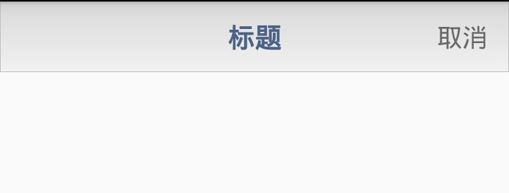
这是一个顶部布局样式,在很多app中我们会考虑使用样式基本相同的顶部布局来统一风格。这只是一个简单的布局,包含一个Title以及取消按钮(这里用的TextView代替),相对于其他几个布局控件,RelativeLayout在这里使用起来更简单也更合理。首先设置RelativeLayout的高度,再设置Title的android:layout_centerInParent=”true”显示在中央,最后设置取消按钮的两个属性垂直居中android:layout_centerVertical=”true”和右部对齐android:layout_alignParentRight=”true”。
四、AbsoluteLayout
绝对布局也叫坐标布局,指定控件的绝对位置,简单直接,直观性强,但是手机屏幕尺寸差别较大,适应性差,Android 1.5已弃用,可以用RelativeLayout替代。
AbsoluteLayout实现布局代码:
<"1.0" encoding="utf-8"?> <AbsoluteLayout xmlns:android="http://schemas.android.com/apk/res/android" android:layout_width="match_parent" android:layout_height="match_parent"> <ImageView android:layout_width="100dip" android:layout_height="120dip" android:layout_x="150dip" android:layout_y="40dip" android:src="@drawable/android_logo"/> <Button android:layout_width="wrap_content" android:layout_height="wrap_content" android:layout_x="100dip" android:layout_y="150dip" android:text="上一张"/> <Button android:layout_width="wrap_content" android:layout_height="wrap_content" android:layout_x="200dip" android:layout_y="150dip" android:text="下一张"/> </AbsoluteLayout>
显示效果:
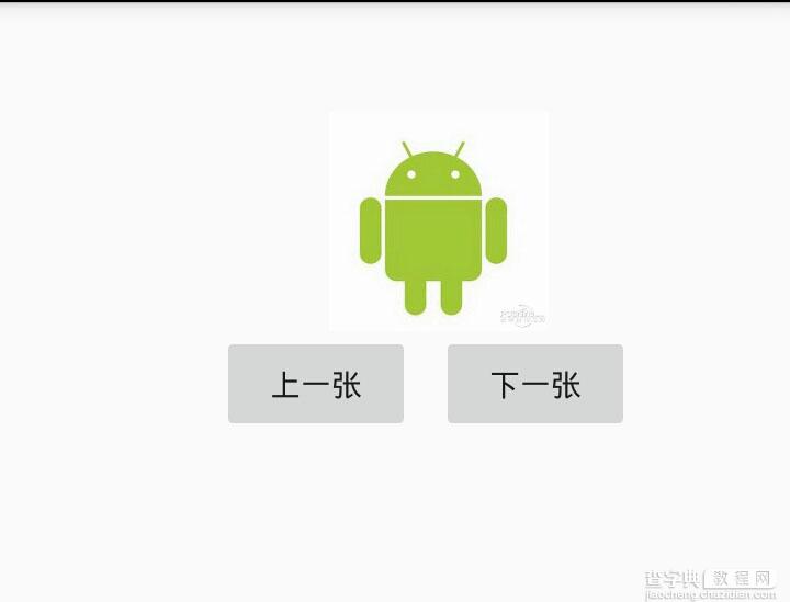
这里为了设计一个图片浏览的效果,将各个控件的layout_x与layout_y依次设置了一遍,然而当前屏幕尺寸能正常显示,其他屏幕就需要重新制定布局。其实用RelativeLayout轻松就能实现这样的效果,还不用考虑屏幕兼容性。 所以,AbsoluteLayout已成为android布局中的历史。
五、TableLayout
表格布局继承自LinearLayout,通过TableRow设置行,列数由TableRow中的子控件决定,直接在TableLayout中添加子控件会占据整个一行。
TableLayout常用属性:
android:shrinkColumns:设置可收缩的列,内容过多就收缩显示到第二行
android:stretchColumns:设置可伸展的列,将空白区域填充满整个列
android:collapseColumns:设置要隐藏的列
列的索引从0开始,shrinkColumns和stretchColumns可以同时设置。
子控件常用属性:
android:layout_column:第几列
android:layout_span:占据列数
TableLayout实例代码:
<"1.0" encoding="utf-8"?> <LinearLayout xmlns:android="http://schemas.android.com/apk/res/android" android:orientation="vertical" android:layout_width="match_parent" android:layout_height="match_parent"> <LinearLayout android:layout_width="match_parent" android:layout_height="50dp" android:gravity="center"> <TextView android:layout_width="wrap_content" android:layout_height="wrap_content" android:text="首页"/> </LinearLayout> <LinearLayout android:layout_width="match_parent" android:layout_height="match_parent" android:layout_weight="1" android:gravity="center"> <TableLayout android:layout_width="match_parent" android:layout_height="match_parent" android:stretchColumns="0,1,2" android:gravity="center"> <TableRow> <TextView android:layout_width="100dp" android:layout_height="100dp" android:layout_margin="5dp" android:background="#e2a617" android:text="文件管理" android:gravity="center"/> <TextView android:layout_width="100dp" android:layout_height="100dp" android:layout_margin="5dp" android:background="#0d637f" android:text="应用商店" android:gravity="center"/> <TextView android:layout_width="100dp" android:layout_height="100dp" android:layout_margin="5dp" android:background="#aa2266" android:text="文件管理" android:gravity="center"/> </TableRow> <TableRow> <TextView android:layout_width="100dp" android:layout_height="100dp" android:layout_margin="5dp" android:background="#45e15f" android:text="应用管理" android:gravity="center"/> <TextView android:layout_width="200dp" android:layout_height="100dp" android:layout_margin="5dp" android:background="#3924a4" android:text="应用中心" android:gravity="center" android:layout_span="2"/> </TableRow> </TableLayout> </LinearLayout> <TableLayout android:layout_width="match_parent" android:layout_height="55dp" android:background="#f5f5f5" android:stretchColumns="0,1,2,3" android:gravity="center_vertical"> <TableRow> <TextView android:layout_width="wrap_content" android:layout_height="wrap_content" android:gravity="center" android:text="首页" /> <TextView android:layout_width="wrap_content" android:layout_height="wrap_content" android:gravity="center" android:text="消息" /> <TextView android:layout_width="wrap_content" android:layout_height="wrap_content" android:gravity="center" android:text="发现" /> <TextView android:layout_width="wrap_content" android:layout_height="wrap_content" android:gravity="center" android:text="我" /> </TableRow> </TableLayout> </LinearLayout>
显示效果:
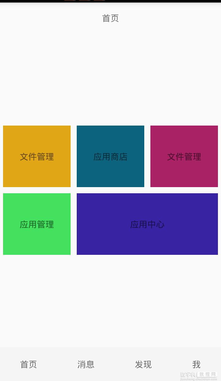
屏幕中心是一个类似Material布局,底部是一个页面切换的导航栏。底部布局通过设置android:stretchColumns=”0,1,2,3″来让四个按钮同样大小显示并填充到整个宽度,中心区域主要使用android:stretchColumns=”0,1,2″填充显示以及android:layout_span=”2″控制大内容跨列显示。
布局在Android界面中相当于建筑物的框架,在开发中我们需要运用多种布局来实现界面显示需求,只有了解了各种布局的显示样式与它们之间的差距,我们才能驾轻就熟、合理的布局界面。
【Android五大布局与实际应用详解】相关文章:
★ Android 动画之AlphaAnimation应用详解