本文将持续添加我自己用原生JS写的各种菜单特效,虽然网上一搜一大堆,但我还是喜欢自己来写一写!
这是上一篇:JavaScript实战(带收放动画效果的导航菜单)
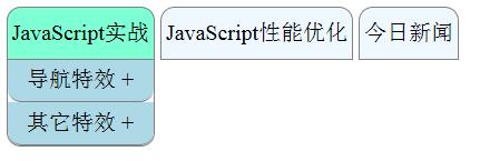
下面是经过优化后的完整代码,优化了CSS样式、简化事件函数、减少HTML层级,删了至少20行以上的冗余代码
<!DOCTYPE html> <html lang="en"> <head> <meta charset="UTF-8"> <title></title> <script> window.onload = function() { //========伸缩动画菜单 var ul = document.getElementById('ul'); if(ul.addEventListener){ ul.addEventListener('mouseover',listener1,true); ul.addEventListener('mouseout',listener2,true); ul.addEventListener('click',listener3,false); }else if(ul.attachEvent){ //兼容IE8及以前版本 ul.attachEvent('onmouseover',listener1,false); ul.attachEvent('onmouseout',listener2,false); ul.attachEvent('onclick',listener3,false); } function listener1(event){ //event = event||window.event; //兼容IE8及以前版本 var target = event.target||event.srcElement; //兼容IE8及以前版本 if(target.tagName.toLowerCase() === 'li') { var div1 = target.getElementsByTagName('div')[0]; div1.style.display = 'block'; div1.style.opacity = 1; } } function listener2(event){ //event = event||window.event; var target = event.target||event.srcElement; if(target.tagName.toLowerCase() === 'li'){ var div1 = target.getElementsByTagName('div')[0]; div1.style.display = 'none'; div1.style.opacity = 0; div1.onmouseover = function(){ div1.style.display = 'block'; div1.style.opacity = 1; }; div1.onmouseout = function(){ div1.style.display = 'none'; div1.style.opacity = 0; }; } } var bool = true; function listener3(event) { var event = event || window.event; var target = event.target || event.srcElement; if (target.className === 'show-hide') { var adiv = target.nextElementSibling; if (window.getComputedStyle(adiv,null).opacity>0.5){bool=false}else{bool=true} var height = 90, changeH, opacity, id; if (bool) { changeH = 0; opacity = 0; var text = target.innerHTML.slice(0,-1); target.innerHTML = text+' -'; (function show() { if (changeH > height) {clearTimeout(id);return} changeH += 5; opacity += 0.06; console.log('opacity:'+adiv.style.opacity+',height :'+adiv.style.height); adiv.style.height = changeH + 'px'; adiv.style.opacity = opacity; adiv.style.display = 'block'; id = setTimeout(function () { clearTimeout(id); show(); }, 16.7); })(); bool = false; } else { changeH = height; opacity = 1; var text = target.innerHTML.slice(0,-1); target.innerHTML = text+' +'; (function hidden() { if (changeH < 0) {clearTimeout(id);adiv.style.display = 'none';return} changeH -= 10; opacity -= 0.11; console.log('opacity:'+adiv.style.opacity+',height :'+adiv.style.height); adiv.style.height = changeH + 'px'; adiv.style.opacity = opacity; id = setTimeout(function () { clearTimeout(id); hidden(); }, 16.7); })(); bool = true; } } } }; </script> <style> *{ margin: 0; padding: 0; } a,img{border:0;} ul{ position: absolute; top: 20px; left: 30px; z-index: 100; } #ul li{ display: inline-block; position: relative; height: 30px; text-align: center; line-height: 30px; padding: 3px; border: 1px solid gray; border-radius: 10px 10px 0 0; background-color: aliceblue; cursor: pointer; -webkit-transition: all ease-in-out 0.3s; -moz-transition: all ease-in-out 0.3s; -ms-transition: all ease-in-out 0.3s; -o-transition: all ease-in-out 0.3s; transition: all ease-in-out 0.3s; } #ul li:hover{background-color: aquamarine;} .nav-div{ position: absolute; width: 100%; left: -1px; top: 37px; display: none; border: 1px solid gray; border-top: 0; border-radius:0 0 10px 10px; background-color: aliceblue; } .show-hide{ position: relative; display: block; border-radius:0 0 10px 10px; background-color: lightblue; -webkit-transition: all ease-in-out 0.3s; -moz-transition: all ease-in-out 0.3s; -ms-transition: all ease-in-out 0.3s; -o-transition: all ease-in-out 0.3s; transition: all ease-in-out 0.3s; border-bottom: 1px solid gray; } .show-hide:hover{background-color: lavender} .a-div{ background-color: aliceblue; display: none; border-radius:0 0 10px 10px; opacity: 0} .a{ z-index: -1; display: block; text-decoration: none; border-radius:10px; -webkit-transition: all ease-in-out 0.3s; -moz-transition: all ease-in-out 0.3s; -ms-transition: all ease-in-out 0.3s; -o-transition: all ease-in-out 0.3s; transition: all ease-in-out 0.3s; } .a:hover{background-color: lavender} </style> </head> <body> <ul id="ul"> <li>JavaScript实战 <div> <span>导航特效 +</span> <div> <a href="">可收放子菜单</a> <a href="">切换页面</a> <a href="">持续添加中...</a> </div> <span>其它特效 +</span> <div> <a href="">持续添加中...</a> <a href="">持续添加中...</a> <a href="">持续添加中...</a> </div> </div> </li> <li>JavaScript性能优化 <div> <span>财经 +</span> <div> <a href="">今日头条</a> <a href="">所有新闻</a> <a href="">往日回看</a> </div> <span>科技 +</span> <div> <a href="">今日头条</a> <a href="">所有新闻</a> <a href="">往日回看</a> </div> </div> </li> <li>今日新闻 <div> <span>财经 +</span> <div> <a href="">今日头条</a> <a href="">所有新闻</a> <a href="">往日回看</a> </div> <span>科技 +</span> <div> <a href="">今日头条</a> <a href="">所有新闻</a> <a href="">往日回看</a> </div> </div> </li> </ul> </body> </html>
效果图:
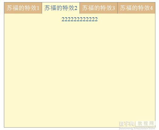
下面是第二个特效:(具体实现比第一个简单很多,主要注意CSS布局)
<!DOCTYPE html> <html lang="en"> <head> <meta charset="UTF-8"> <title></title> <style> *{ margin: 0; padding: 0; } a,img{border:0;} #menu{ position: absolute; top: 30px; left: 0; right: 0; margin: auto; width: 400px; border-left: 1px solid gray; border-top: 1px solid gray; background-color: lemonchiffon; text-align: center; } #menu li{ list-style: none; float: left; width: 99px; height: 30px; line-height: 30px; border-right: 1px solid gray; background-color: burlywood; color: white; -webkit-transition: all ease-in-out 0.5s; -moz-transition: all ease-in-out 0.5s; -ms-transition: all ease-in-out 0.5s; -o-transition: all ease-in-out 0.5s; transition: all ease-in-out 0.5s; } #menu li:hover{ background-color: lemonchiffon; color: #336699; } .contain{ position: absolute; left: -1px; display: none; width: 399px; height: 300px; color: #336699; border-left: 1px solid gray; border-right: 1px solid gray; border-bottom: 1px solid gray; background-color: lemonchiffon; } </style> <script> window.onload = function(){ var menu = document.getElementById('menu'); if(menu.addEventListener){ menu.addEventListener('mouseover',show,false); menu.addEventListener('mouseout',hide,false); }else if(menu.attachEvent){ menu.attachEvent('onmouseover',show,false); menu.attachEvent('onmouseout',hide,false); } function show(event){ var target = event.target||event.srcElement; if(target.tagName.toLowerCase() === 'li'){ target.firstElementChild.style.display = 'block'; }else if(target.parentNode.tagName.toLowerCase() === 'li'){ target.style.display = 'block'; } } function hide(event){ var target = event.target||event.srcElement; if(target.tagName.toLowerCase() === 'li'){ target.firstElementChild.style.display = 'none'; }else if(target.parentNode.tagName.toLowerCase() === 'li'){ target.style.display = 'none'; } } } </script> </head> <body> <div id="menu"> <ul> <li id="menu1">苏福的特效1 <div>111111111111</div> </li> <li id="menu2">苏福的特效2 <div>222222222222</div> </li> <li id="menu3">苏福的特效3 <div>333333333333</div> </li> <li id="menu4">苏福的特效4 <div>444444444444</div> </li> </ul> </div> </body> </html>
效果图:
以上就是本文的全部内容,希望对大家的学习有所帮助,也希望大家多多支持查字典教程网。
【JavaScript实战之菜单特效】相关文章:
★ JavaScript 正则表达式中global模式的特性
★ JavaScript实现DIV层拖动及动态增加新层的方法