本文和大家一起做一个带箭头的圆角矩形菜单,大概长下面这个样子:
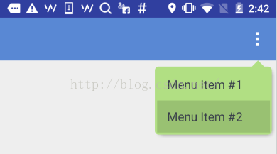
要求顶上的箭头要对准菜单锚点,菜单项按压反色,菜单背景色和按压色可配置。
最简单的做法就是让UX给个三角形的图片往上一贴,但是转念一想这样是不是太low了点,而且不同分辨率也不太好适配,干脆自定义一个ViewGroup吧!
自定义ViewGroup其实很简单,基本都是按一定的套路来的。
一、定义一个attrs.xml
就是声明一下你的这个自定义View有哪些可配置的属性,将来使用的时候可以自由配置。这里声明了7个属性,分别是:箭头宽度、箭头高度、箭头水平偏移、圆角半径、菜单背景色、阴影色、阴影厚度。
<resources> <declare-styleable name="ArrowRectangleView"> <attr name="arrow_width" format="dimension" /> <attr name="arrow_height" format="dimension" /> <attr name="arrow_offset" format="dimension" /> <attr name="radius" format="dimension" /> <attr name="background_color" format="color" /> <attr name="shadow_color" format="color" /> <attr name="shadow_thickness" format="dimension" /> </declare-styleable> </resources>
二、写一个继承ViewGroup的类,在构造函数中初始化这些属性
这里需要用到一个obtainStyledAttributes()方法,获取一个TypedArray对象,然后就可以根据类型获取相应的属性值了。需要注意的是该对象用完以后需要显式调用recycle()方法释放掉。
public class ArrowRectangleView extends ViewGroup { ... ... public ArrowRectangleView(Context context, AttributeSet attrs, int defStyleAttr) { super(context, attrs, defStyleAttr); TypedArray a = context.getTheme().obtainStyledAttributes(attrs, R.styleable.ArrowRectangleView, defStyleAttr, 0); for (int i = 0; i < a.getIndexCount(); i++) { int attr = a.getIndex(i); switch (attr) { case R.styleable.ArrowRectangleView_arrow_width: mArrowWidth = a.getDimensionPixelSize(attr, mArrowWidth); break; case R.styleable.ArrowRectangleView_arrow_height: mArrowHeight = a.getDimensionPixelSize(attr, mArrowHeight); break; case R.styleable.ArrowRectangleView_radius: mRadius = a.getDimensionPixelSize(attr, mRadius); break; case R.styleable.ArrowRectangleView_background_color: mBackgroundColor = a.getColor(attr, mBackgroundColor); break; case R.styleable.ArrowRectangleView_arrow_offset: mArrowOffset = a.getDimensionPixelSize(attr, mArrowOffset); break; case R.styleable.ArrowRectangleView_shadow_color: mShadowColor = a.getColor(attr, mShadowColor); break; case R.styleable.ArrowRectangleView_shadow_thickness: mShadowThickness = a.getDimensionPixelSize(attr, mShadowThickness); break; } } a.recycle(); }
三、重写onMeasure()方法
onMeasure()方法,顾名思义,就是用来测量你这个ViewGroup的宽高尺寸的。
我们先考虑一下高度:
•首先要为箭头跟圆角预留高度,maxHeight要加上这两项
•然后就是测量所有可见的child,ViewGroup已经提供了现成的measureChild()方法
•接下来就把获得的child的高度累加到maxHeight上,当然还要考虑上下的margin配置
•除此以外,还需要考虑到上下的padding,以及阴影的高度
•最后通过setMeasuredDimension()设置生效
在考虑一下宽度:
•首先也是通过measureChild()方法测量所有可见的child
•然后就是比较这些child的宽度以及左右的margin配置,选最大值
•接下来还有加上左右的padding,以及阴影宽度
•最后通过setMeasuredDimension()设置生效
@Override protected void onMeasure(int widthMeasureSpec, int heightMeasureSpec) { int count = getChildCount(); int maxWidth = 0; // reserve space for the arrow and round corners int maxHeight = mArrowHeight + mRadius; for (int i = 0; i < count; i++) { final View child = getChildAt(i); final MarginLayoutParams lp = (MarginLayoutParams) child.getLayoutParams(); if (child.getVisibility() != GONE) { measureChild(child, widthMeasureSpec, heightMeasureSpec); maxWidth = Math.max(maxWidth, child.getMeasuredWidth() + lp.leftMargin + lp.rightMargin); maxHeight = maxHeight + child.getMeasuredHeight() + lp.topMargin + lp.bottomMargin; } } maxWidth = maxWidth + getPaddingLeft() + getPaddingRight() + mShadowThickness; maxHeight = maxHeight + getPaddingTop() + getPaddingBottom() + mShadowThickness; setMeasuredDimension(maxWidth, maxHeight); }
看起来是不是很简单?当然还有两个小问题:
1. 高度为圆角预留尺寸的时候,为什么只留了一个半径,而不是上下两个半径?
其实这是从显示效果上来考虑的,如果上下各留一个半径,会造成菜单的边框很厚不好看,后面实现onLayout()的时候你会发现,我们布局菜单项的时候会往上移半个半径,这样边框看起来就好看多了。
2. Child的布局参数为什么可以强转成MarginLayoutParams?
这里其实需要重写另一个方法generateLayoutParams(),返回你想要布局参数类型。一般就是用MarginLayoutParams,当然你也可以用其他类型或者自定义类型。
@Override public ViewGroup.LayoutParams generateLayoutParams(AttributeSet attrs) { return new MarginLayoutParams(getContext(), attrs); }
四、重写onLayout()方法
onLayout()方法,顾名思义,就是用来布局这个ViewGroup里的所有子View的。
实际上每个View都有一个layout()方法,我们需要做的只是把合适的left/top/right/bottom坐标传入这个方法就可以了。
这里就可以看到,我们布局菜单项的时候往上提了半个半径,因此topOffset只加了半个半径,另外右侧的坐标也只减了半个半径。
@Override protected void onLayout(boolean changed, int l, int t, int r, int b) { int count = getChildCount(); int topOffset = t + mArrowHeight + mRadius/2; int top = 0; int bottom = 0; for (int i = 0; i < count; i++) { final View child = getChildAt(i); top = topOffset + i * child.getMeasuredHeight(); bottom = top + child.getMeasuredHeight(); child.layout(l, top, r - mRadius/2 - mShadowThickness, bottom); } }
五、重写dispatchDraw()方法
这里因为我们是写了一个ViewGroup容器,本身是不需要绘制的,因此我们就需要重写它的dispatchDraw()方法。如果你重写的是一个具体的View,那也可以重写它的onDraw()方法。
绘制过程分为三步:
1. 绘制圆角矩形
这一步比较简单,直接调用Canvas的drawRoundRect()就完成了。
2. 绘制三角箭头
这个需要根据配置的属性,设定一个路径,然后调用Canvas的drawPath()完成绘制。
3. 绘制菜单阴影
这个说白了就是换一个颜色再画一个圆角矩形,位置略有偏移,当然还要有模糊效果。
要获得模糊效果,需要通过Paint的setMaskFilter()进行配置,并且需要关闭该图层的硬件加速,这一点在API里有明确说明。
除此以外,还需要设置源图像和目标图像的重叠模式,阴影显然要叠到菜单背后,根据下图可知,我们需要选择DST_OVER模式。
其他细节看代码就清楚了:
@Override protected void dispatchDraw(Canvas canvas) { // disable h/w acceleration for blur mask filter setLayerType(View.LAYER_TYPE_SOFTWARE, null); Paint paint = new Paint(); paint.setAntiAlias(true); paint.setColor(mBackgroundColor); paint.setStyle(Paint.Style.FILL); // set Xfermode for source and shadow overlap paint.setXfermode(new PorterDuffXfermode(PorterDuff.Mode.DST_OVER)); // draw round corner rectangle paint.setColor(mBackgroundColor); canvas.drawRoundRect(new RectF(0, mArrowHeight, getMeasuredWidth() - mShadowThickness, getMeasuredHeight() - mShadowThickness), mRadius, mRadius, paint); // draw arrow Path path = new Path(); int startPoint = getMeasuredWidth() - mArrowOffset; path.moveTo(startPoint, mArrowHeight); path.lineTo(startPoint + mArrowWidth, mArrowHeight); path.lineTo(startPoint + mArrowWidth / 2, 0); path.close(); canvas.drawPath(path, paint); // draw shadow if (mShadowThickness > 0) { paint.setMaskFilter(new BlurMaskFilter(mShadowThickness, BlurMaskFilter.Blur.OUTER)); paint.setColor(mShadowColor); canvas.drawRoundRect(new RectF(mShadowThickness, mArrowHeight + mShadowThickness, getMeasuredWidth() - mShadowThickness, getMeasuredHeight() - mShadowThickness), mRadius, mRadius, paint); } super.dispatchDraw(canvas); }
六、在layout XML中引用该自定义ViewGroup
到此为止,自定义ViewGroup的实现已经完成了,那我们就在项目里用一用吧!使用自定义ViewGroup和使用系统ViewGroup组件有两个小区别:
一、是要指定完整的包名,否则运行的时候会报找不到该组件。
二、是配置自定义属性的时候要需要另外指定一个名字空间,避免跟默认的android名字空间混淆。比如这里就指定了一个新的app名字空间来引用自定义属性。
<"1.0" encoding="utf-8"?> <com.xinxin.arrowrectanglemenu.widget.ArrowRectangleView xmlns:android="http://schemas.android.com/apk/res/android" xmlns:app="http://schemas.android.com/apk/res-auto" android:layout_width="wrap_content" android:layout_height="wrap_content" android:orientation="vertical" android:background="@android:color/transparent" android:paddingLeft="3dp" android:paddingRight="3dp" android:splitMotionEvents="false" app:arrow_offset="31dp" app:arrow_width="16dp" app:arrow_height="8dp" app:radius="5dp" app:background_color="#ffb1df83" app:shadow_color="#66000000" app:shadow_thickness="5dp"> <LinearLayout android:id="@+id/cmx_toolbar_menu_turn_off" android:layout_width="wrap_content" android:layout_height="42dp"> <TextView android:layout_width="wrap_content" android:layout_height="wrap_content" android:layout_gravity="center_vertical" android:textSize="16sp" android:textColor="#FF393F4A" android:paddingLeft="16dp" android:paddingRight="32dp" android:clickable="false" android:text="Menu Item #1"/> </LinearLayout> <LinearLayout android:id="@+id/cmx_toolbar_menu_feedback" android:layout_width="wrap_content" android:layout_height="42dp"> <TextView android:layout_width="wrap_content" android:layout_height="wrap_content" android:layout_gravity="center_vertical" android:textSize="16sp" android:textColor="#FF393F4A" android:paddingLeft="16dp" android:paddingRight="32dp" android:clickable="false" android:text="Menu Item #2"/> </LinearLayout> </com.xinxin.arrowrectanglemenu.widget.ArrowRectangleView>
七、在代码里引用该layout XML
这个就跟引用正常的layout XML没有什么区别了,这里主要是在创建弹出菜单的时候指定了刚刚那个layout XML,具体看下示例代码就清楚了。
至此,一个完整的自定义ViewGroup的流程就算走了一遍了,后面有时间可能还会写一些复杂一些的自定义组件,但是万变不离其宗,基本的原理跟步骤都是相同的。本文就是抛砖引玉,希望能给需要自定义ViewGroup的朋友一些帮助。
以上就是本文的全部内容,希望对大家的学习有所帮助,也希望大家多多支持查字典教程网。
【Android自定义ViewGroup实现带箭头的圆角矩形菜单】相关文章:
★ 自定义RadioButton和ViewPager实现TabHost带滑动的页卡效果